
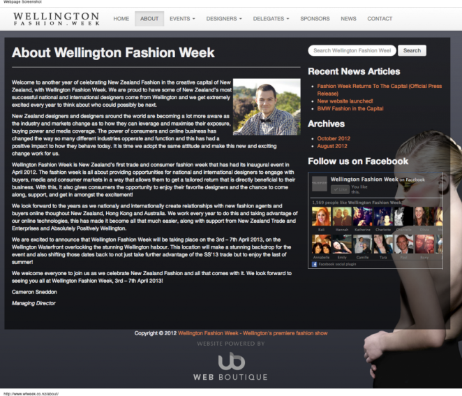
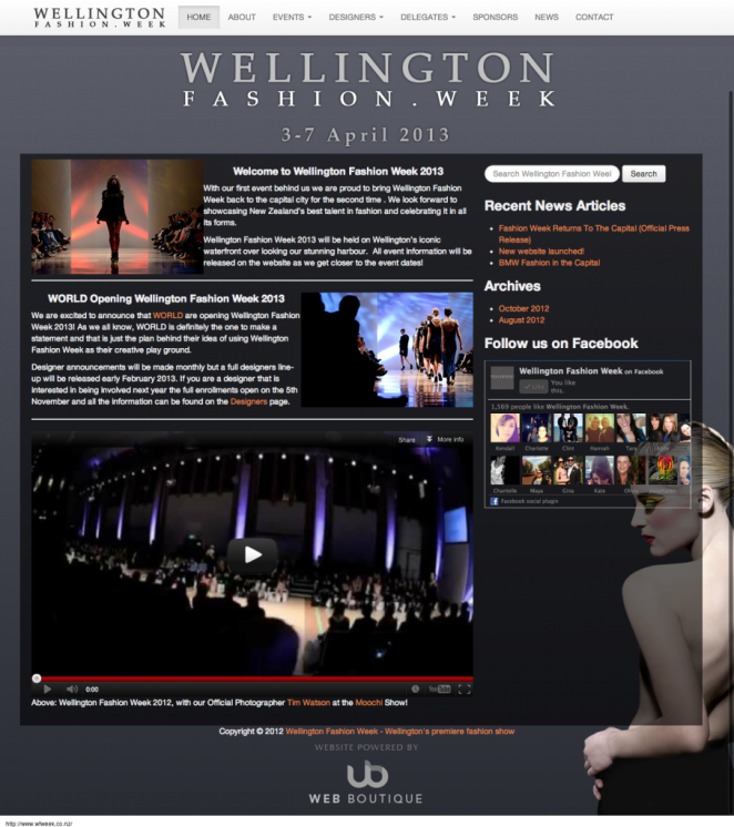
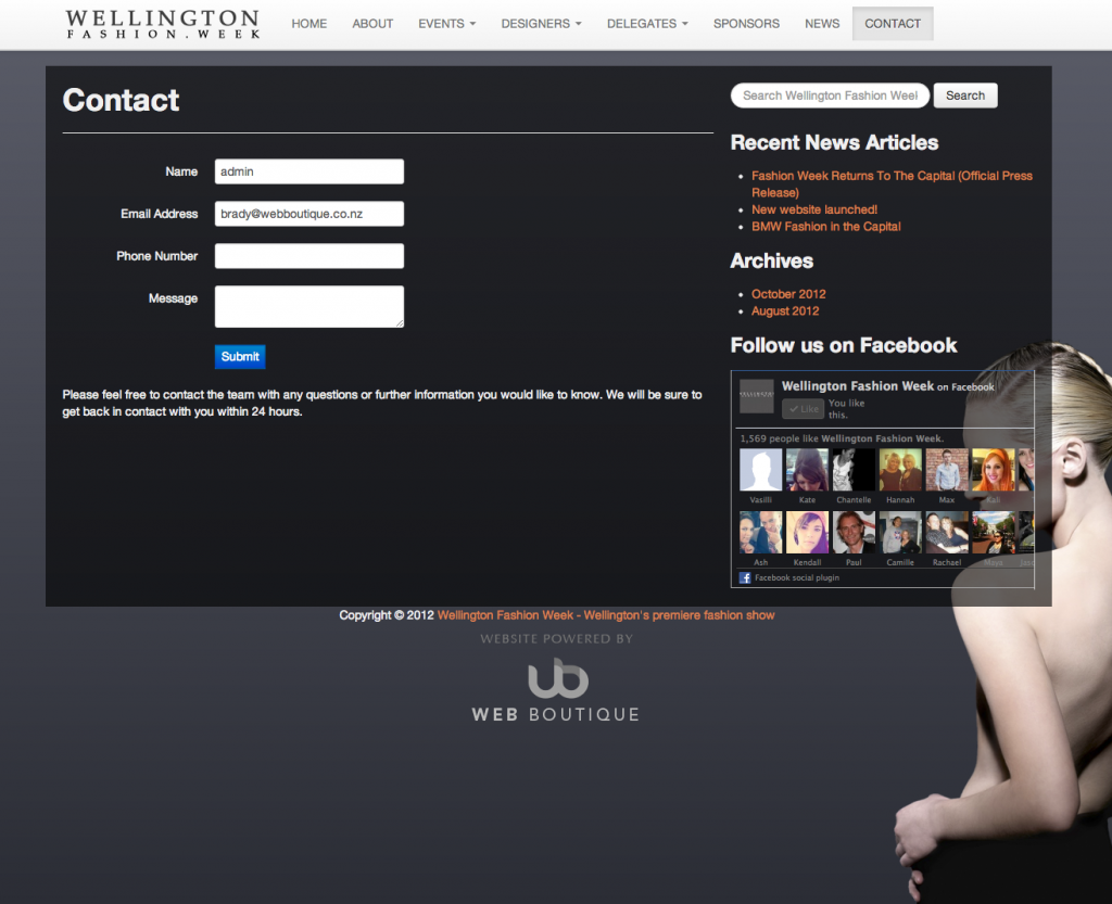
Launched in 2013, Wellington Fashion Week is back for its second year! With a new year ahead, a new website was in order. Who better to come to than our team to design something special.
We decided to create a website that was truly responsive. Till now mobile web experiences have often involved going to special website links for mobile users (such as http://mobile.something.com).
While this has worked for years, it’s not really that great. Your customers have to know that the mobile link exists, and for a lot of people searching a website called Google, they wont find this link easily.
A truly responsive website loads the same page for everyone, regardless of their device, browser, or screen resolution size. The page literally morphs on it’s own to suit each users viewport, literally giving them a unique experience.
Go ahead and load the website for yourself, and then resize the size of your browser and you’ll literally see the page adjust like magic.

